- G Letz Design Design System
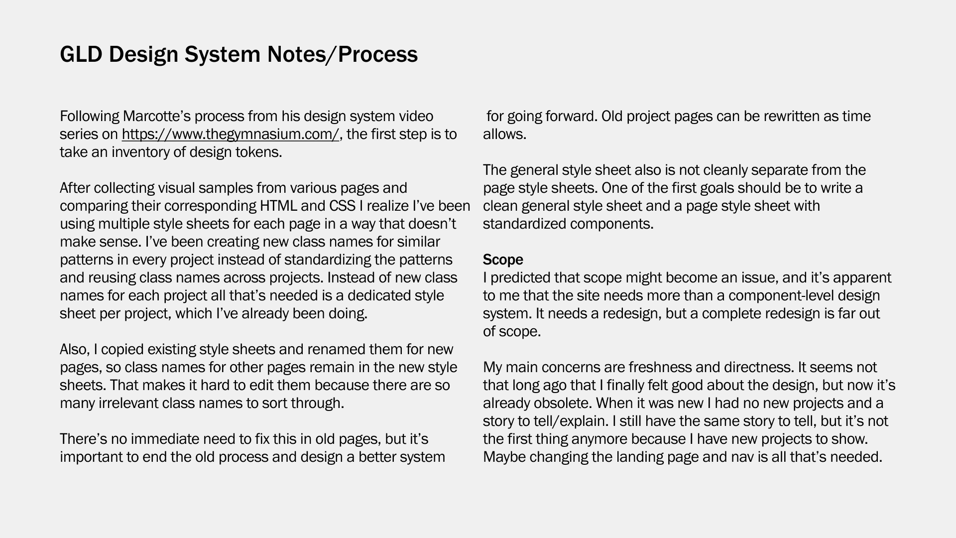
This is long overdue. My portfolio website has grown far beyond its original foundation. I've been adding pages and styles and patterns on an as-needed basis without any effort toward documentation for far too long. Just containing the scope might be a problem but not starting broadly enough might not really fix anything. I might have to feel my way through this and adjust the steps as I go along.
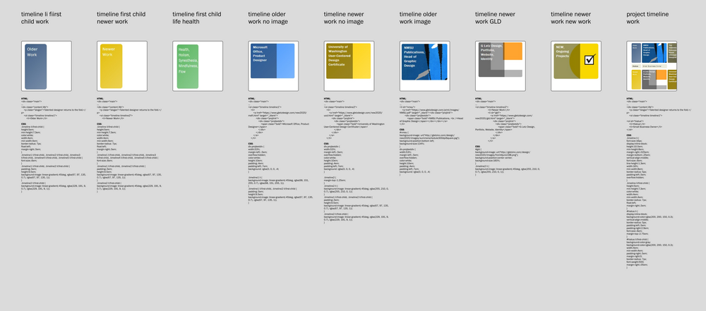
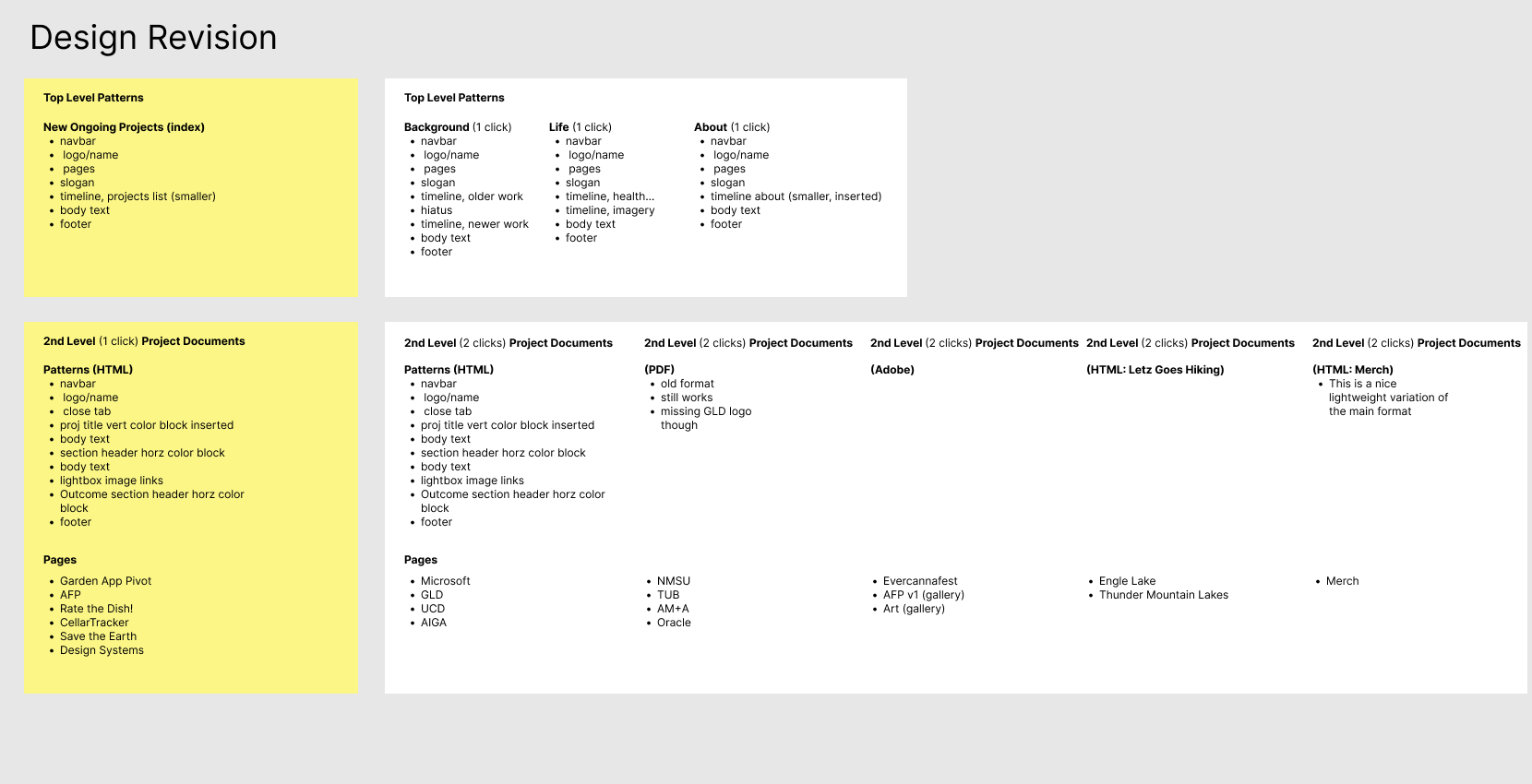
- Identify design tokens and patterns, group and name them.:
- Group and name the tokens, and create a pattern library in Figma:
Despite my fears of creeping scope it didn't make sense to proceed with simply collecting and naming tokens. There aren't enough basic patterns to require it. The problem lay more in the code than the design. Refactoring would be tedious, but it was necessary.
First, I would need to sort and group the styles into non-overlapping style sheets. Next, identify and rename all the aliases for each of the basic patterns. Finally, because the design and styling of the pages has become more sophisticated over time, apply new code to older pages.
The result is kind of amazing, to me at least. The ease of site-wide edits feels profoundly liberating, and the new visual consistency is immediately noticeable. (Refresh your browser and see if you agree.) I'm not a developer, but I feel like I've gained a firsthand understanding of the term "technical debt."
Now it makes sense to proceed with a pattern library. Please stay tuned.
Update: I've been away from this for a while. I decided to expand my site by making it more responsive, and maybe even making a simple, companion web app. I hope I haven't lost anyone who may be following along.
A pattern library is created by collecting examples of all the UI patterns across products, and then collaboratively grouping and naming them. Card sorting and sticky notes are common tools/methods used in this activity. I don't have a design team, though, and having cleaned up the site's code to standardize classes and styles, there doesn't seem to be much point in creating a pattern library. To show the full power of Figma design systems I would need a more complex example.
I took some JavaScript classes years ago but it was mostly beyond my needs. To take on these new tasks I would need to refresh what I learned. Aquent Gymnasium has an impressive library of educational videos for designers. I've studied most of the topics before, but it's been useful to brush up. I'm excited to expand my toolbox with refreshed skills.
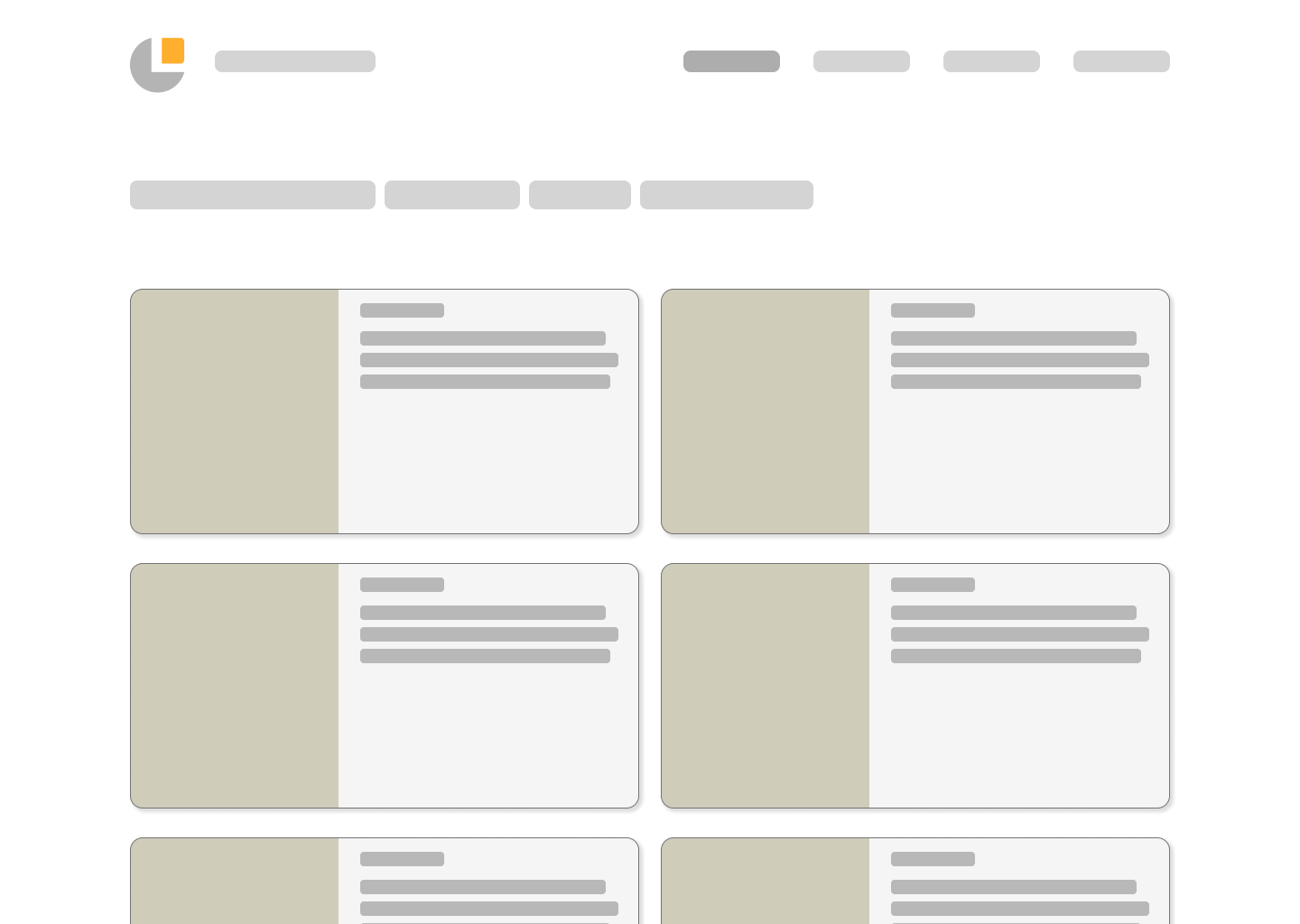
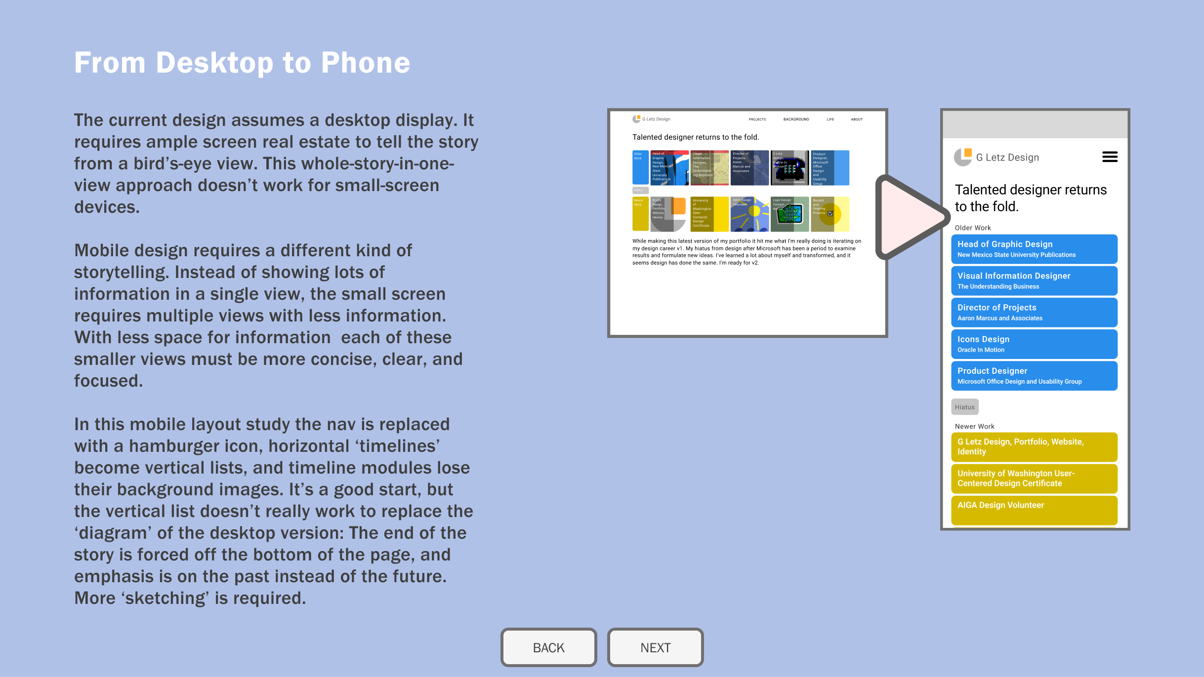
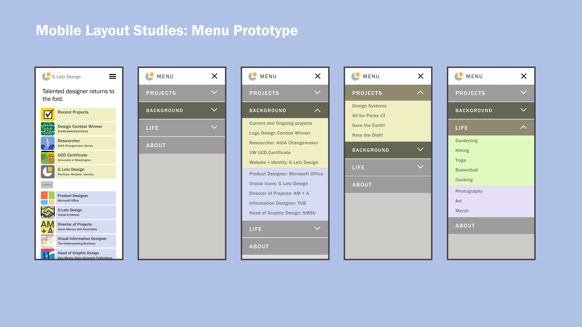
I'll start with making the site more responsive. The effects probably won't be noticeable to most unless you know to look for them, but that's kind of the point. For those to whom they are notcieable they may make a big difference. First step, design a responsive menu and navigation.
- Add design principles and guidance for when and how to consistently adapt and apply patterns from the library across a variety of contexts. [in progress]
- Outcome
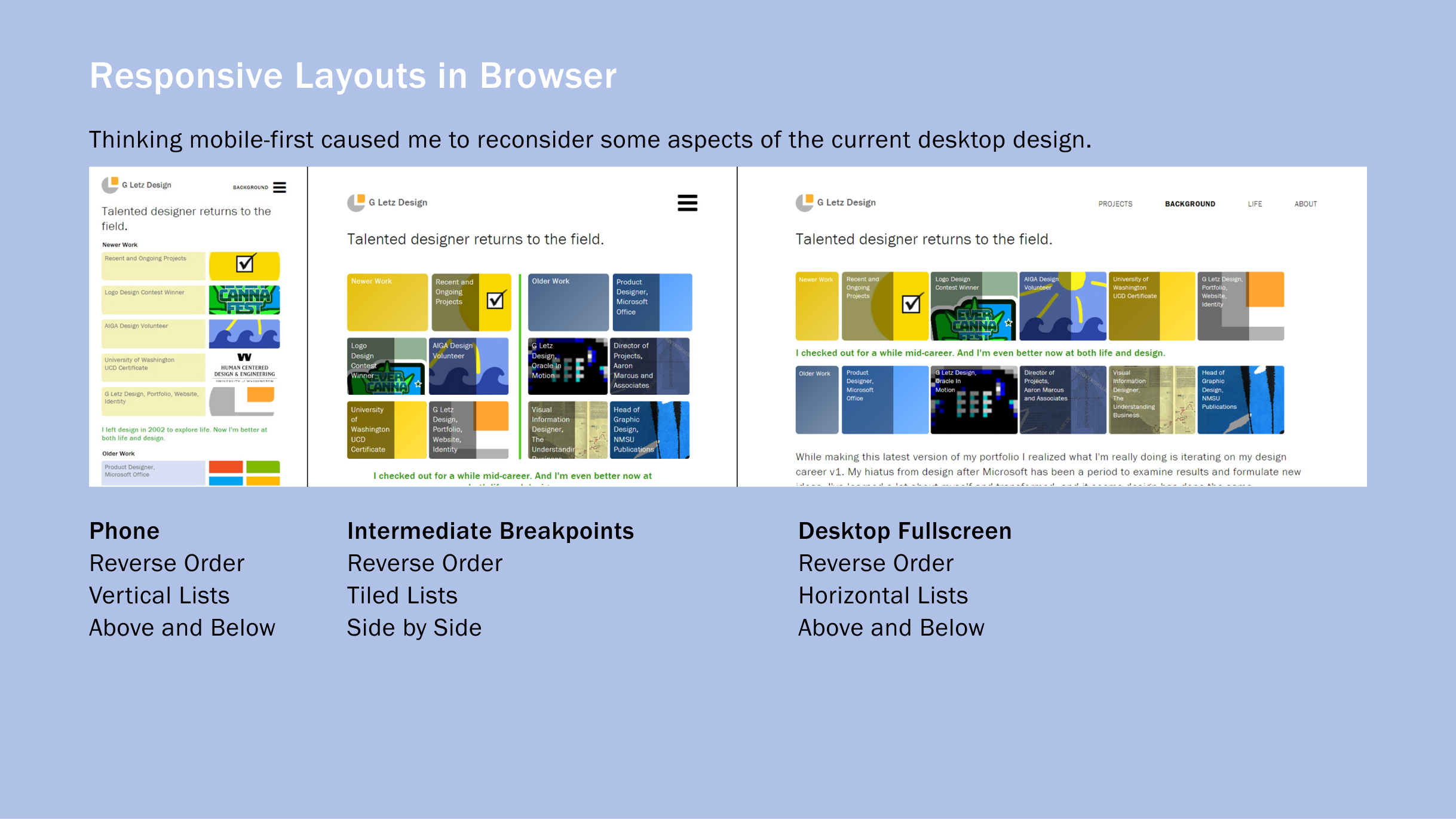
I've been working on implementing these designs in the browser and I discovered there are intermediate layouts needed between the desktop and mobile versions. I also gained newfound appreciation for mobile first. Some of the content in the desktop version needed to be reordered for mobile. In a mobile-first process that wouldn't have been necessary. It also reopened some old design decisions I thought I had moved on from. It feels a little disruptive, but it's invigorating for the evolution of the design as a system.
I'm still fussing with styles and details so the responsive version isn't quite ready for prime time yet, but stay tuned.
[8/11/22] It's live! Change the width of your browser window to see it in action, or open it on a phone and change the orientation.
Although reponsive design was not new to me, this was my first attempt to implement one. The concepts are not difficult, but writing and debugging the code was very tedious the first time through. This is just a start though. I'd like to improve my site's codebase to create a bridge between the Figma design system and the site's implementation. Still, it's exciting to see my site properly displayed on a phone instead of the shrunk-down, desktop design.
