- Cellar-Tracker Heuristic Review
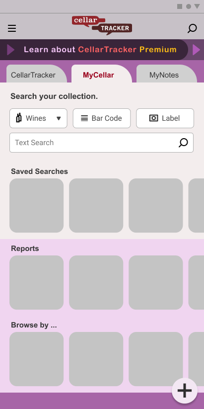
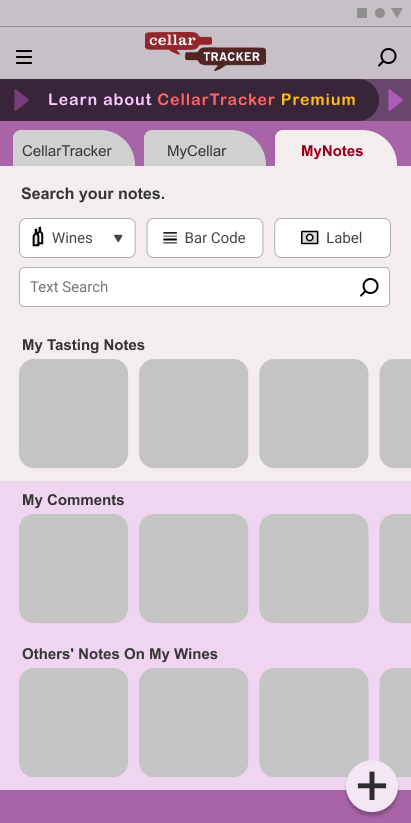
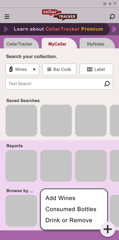
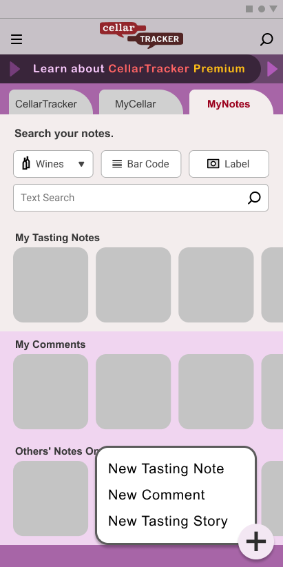
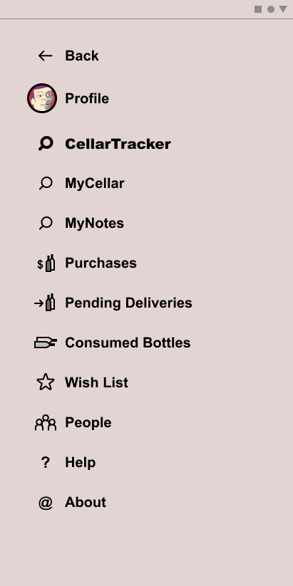
I did a quick heuristic review of CellarTracker, a mobile app to keep track of a wine collection. They had already established a large following on the desktop, and I think this was their first release as a mobile app.
- Heuristic Review
Explorations of possible improvements along several UX dimensions, including IA, IxD, visual hierarchy, mobile interaction patterns, and branding, for three tabs in the app's home screen:
The result is better gestalt, more immediate recognition of what there is to do, how to do it, and a more attractive appearance.
- Figma
After the heuristic review I made it a Figma project.
- Outcome
Figma is like a breath of fresh air among the many similar design tools I've used. I'm still working in Figma and getting better at it all the time. A future project may be to port my portfolio to Figma and create a design system for it.
