- UW BFA


University of Washington BFA
Data Visualization
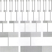
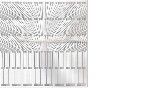
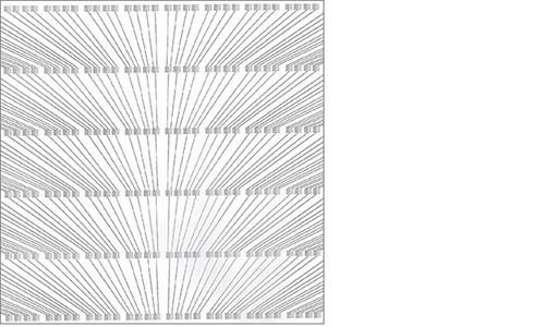
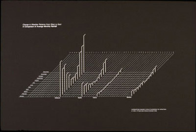
Upper left: Change in Weather Patterns from West to East: A Comparison of Average Monthly Rainfall
Lower right: Numbered lines represent inches of precipitation for vertical bars or miles x 10 east west distance between cities.
Cities from left to right: Quillayute, Seattle, Yakima, Spokane
-
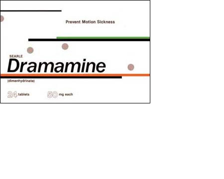 Pharmaceutical Package
 -
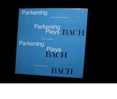 Album Cover
-
- SMU publication


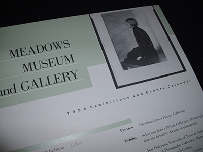
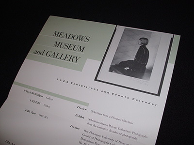
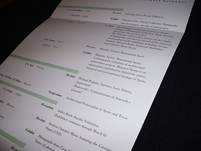
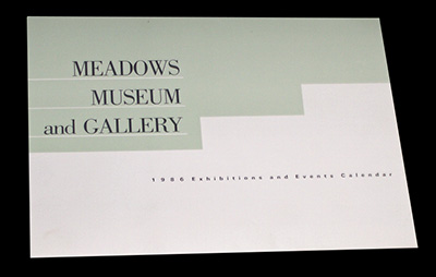
Meadows Museum and Gallery 1986 Exhibitions and Events Calendar
One of my college professors advised me to leave Seattle and go to a bigger city to look for my first job as a designer. For reasons I don't entirely remember, I moved to Dallas, TX. While there, I freelanced at Southern Methodist University designing campus publications.
-
- NMSU Publications


New Mexico State University, Information Services
From March, 1986, to December, 1987, I was the head of graphic design for Information Services at New Mexico State University in Las Cruces.
 This stylized illustration of a yucca plant was used on the cover of a course catalog. It reflects the character of the environment in southern New Mexico where yucca plants are extremely common in the countryside.
-
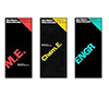
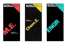 When I arrived in Las Cruces, all of the various colleges' departmental brochures had their own, unique design.
I was able to convince The College of Engineering to adopt this template design and color coding scheme for all of their departmental brochures. The new design created a consistent visual identity for the College, and greatly reduced the workload and stress level at Information Services. -

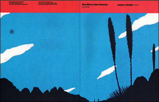 Cover design for the 1988 Summer Schedule.
 -
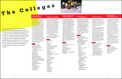 Spread from an annual viewbook.
-
- Information design
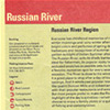

The Understanding Business, Community Access Pages
1988: I worked for Richard Saul Wurman's The Understanding Business, in San Francisco, on The Pac Bell SMART Yellow Pages. From a 1988 Communication Arts article: "What they came up with were two sections that would collectively become known as the Smart Yellow Pages. The first called Community Access Pages, a collection not unlike the Access guides, which contain information about community services, events, recreational activities and attractions specific to the geographical area served by each book."
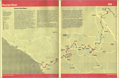 Cartography by Bonnie Scranton.
The Community Access Pages were approximately 10-30 pages of local information at the front of every Pac Bell Yellow Pages directory in California. We researched, wrote, designed, and produced the content for every community in the state on an annual basis.
As a page designer it was my job to propose content, conceptualize, and design the layout for a variety of feature types. I worked with other designers, researchers, writers, editors, cartographers, and illustrators.
-

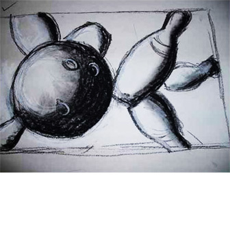
This is a sketch I did for the background image of a Sports Events and Activities spread. We typically hired illustrators for final art, and I wasn't confident enough so early in my career to do my own illustration. The next image shows the final result.
-
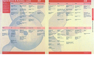
I wasn't happy with this result, and I learned a valuable design lesson then: If you don't speak up for your own standards, you'll likely regret it for a long time.
-
- Publish! magazine

Publish! magazine
1989: Working for Aaron Marcus and Associates (AM+A), I designed and wrote the copy for this Page Makeover article in the January, 1990, issue of Publish! magazine.
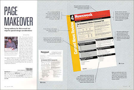
-

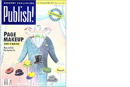 Publish! January, 1990
-
- Interactive diskette

Three Paths to Color
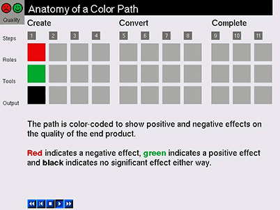
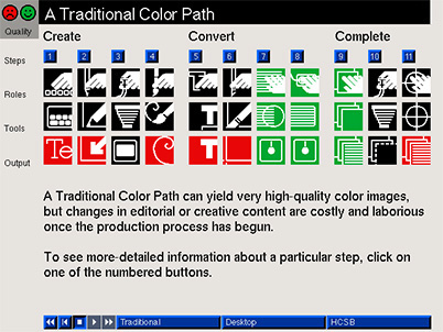
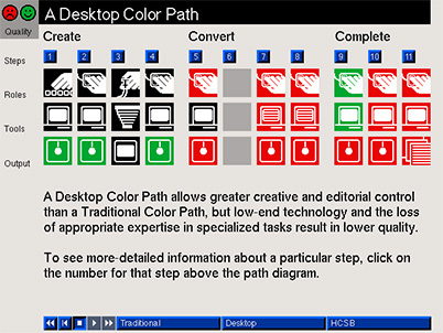
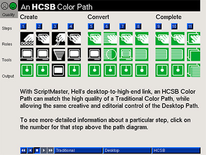
1990: I conceived, designed, developed and wrote the copy for AM+A on a project* for Hell Graphic Systems, a maker of high-end color prepress equipment. The diskette was one component of the project. The entire program fit on one 850k floppy disk. This animated introduction from the diskette explains the concept of a color production path.
 Icons by Joachim Muller-Lance.A Traditional Color Path
 1
1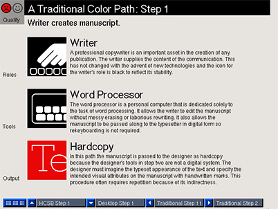 2
2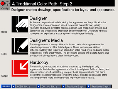 3
3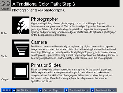 4
4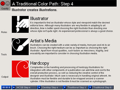 5
5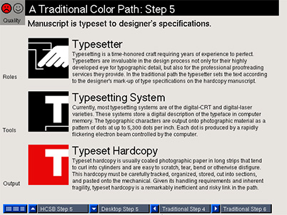 6
6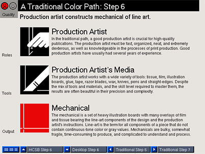 7
7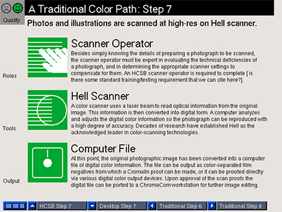 8
8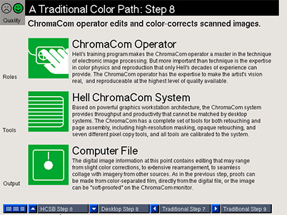 9
9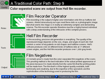 10
10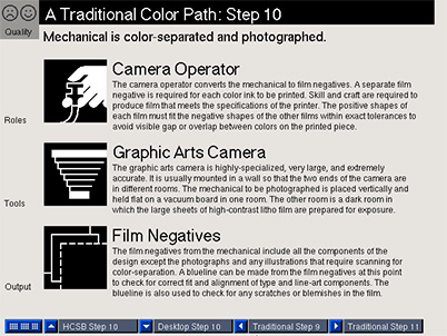 11
11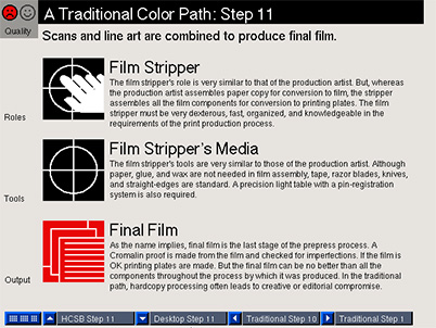 A Desktop Color Path
 1
1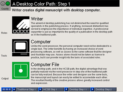 2
2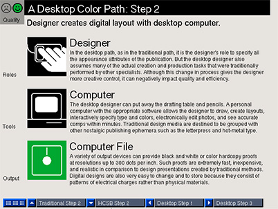 3
3 4
4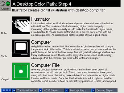 5
5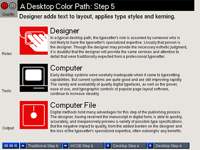 6
6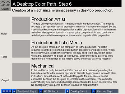 7
7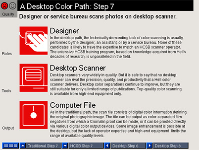 8
8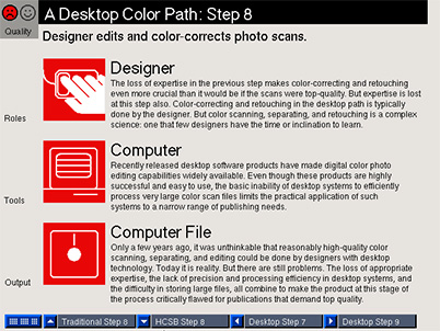 9
9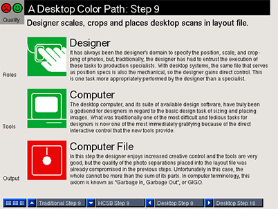 10
10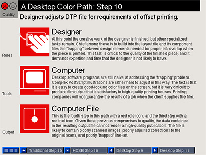 11
11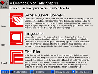 A HCSB Color Path
 1
1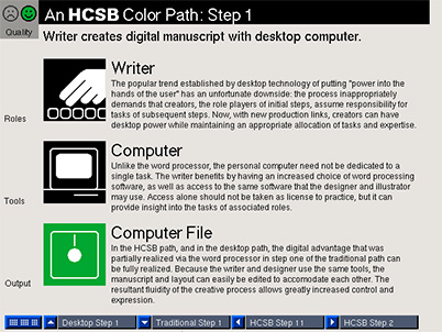 2
2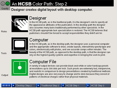 3
3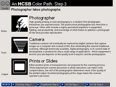 4
4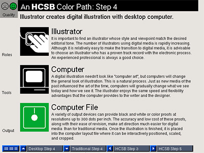 5
5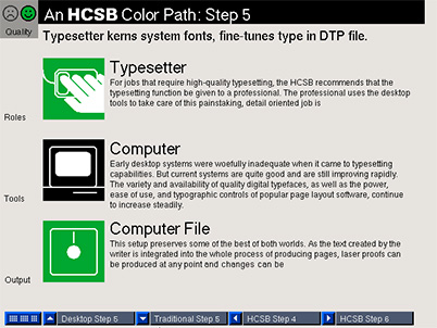 6
6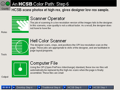 7
7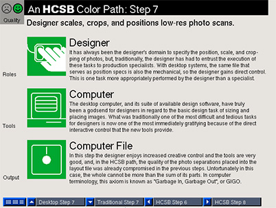 8
8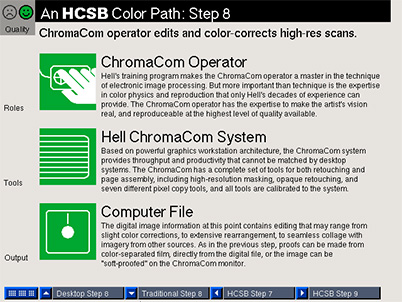 9
9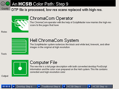 10
10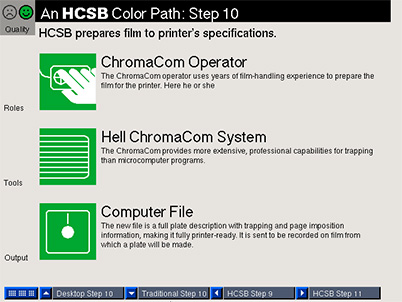 11
11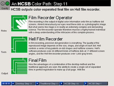
- HCSB illustrations

Hell Color Service Bureau, illustrations
1990: I was the lead researcher, designer, writer and developer for AM+A on a project* for Hell Graphic Systems, a maker of high-end color prepress equipment.
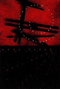
I did a series of illustrations based on the theme of combining the creative freedom afforded by desktop publishing with the quality of high-end, Hell prepress equipment.
The text in the upper half of this illustration is, "It's easy to set type on a curve with desktop publishing," and in the lower half: "rotate text," repeated several times.
-
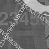
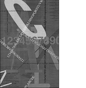
This is another typographic illustration with the theme of combining desktop design freedom and high-end prepress quality.
The original, color version of this illustration no longer exists.
-

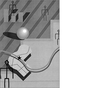
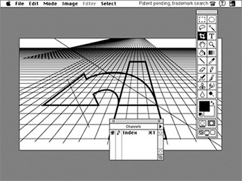
This illustration also has the theme of combining desktop design freedom and high-end prepress quality, but instead of desktop typography, it illustrates desktop drawing capabilities.
The original, color version of this illustration no longer exists.
-
- Design process tool

Motorola's Intelligent Vehicle-Highway Systems' (IVHS) ADVANCE project
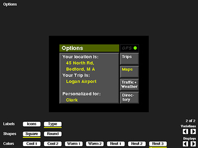
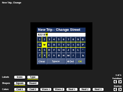
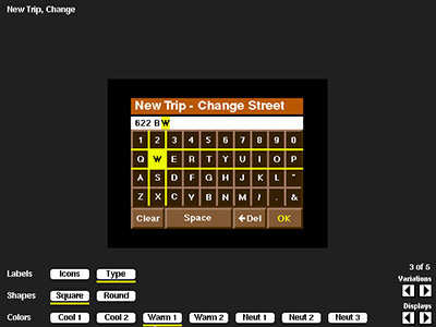
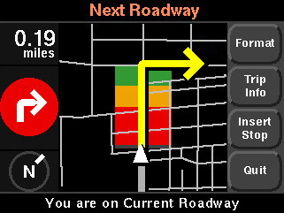
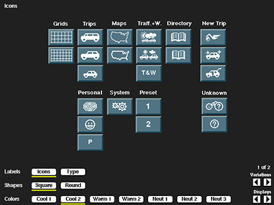
I was the lead designer for Aaron Marcus and Associates (AM+A), of Emeryville, CA, a design consultant for the project. One of the main components of the system was an in-car, touchscreen, GPS navigation assistant, for which AM+A was contracted to design the UI.
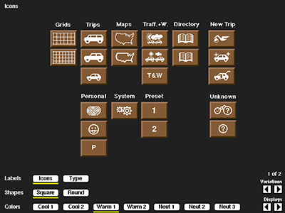
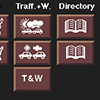
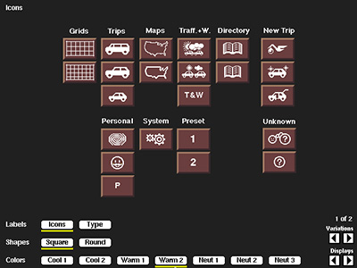
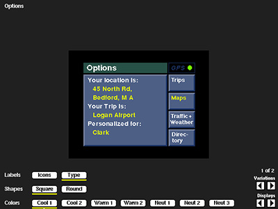
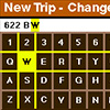
I designed and developed a tool for the client to view and decide on design options such as icons styles, color palettes, etc., that sped up decision making for the look and feel design.
-
- Interaction design

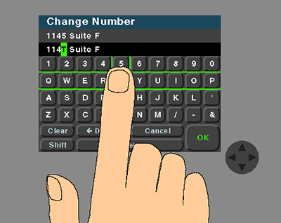
Car Nav System Interaction Design
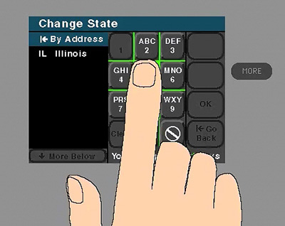
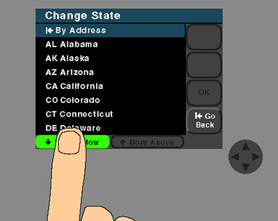
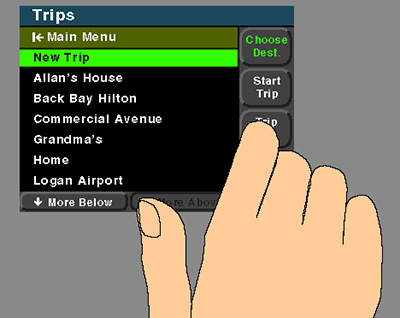
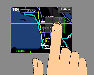
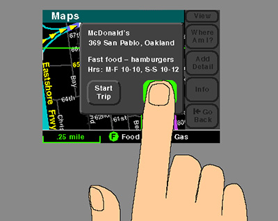
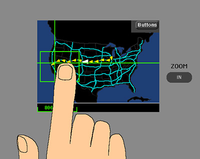
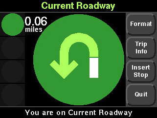
I directed the production of seven animations of interaction scenarios to be used by developers as a detailed visual specification for various highlighting and selection techniques. These were originally created in Macromind Director 3.1 for a Mac IIci. (Click small images to view animations.) Visual design and production: Todd Blank.
- Navi 3D arrows

Should the route guidance arrows show perspective?
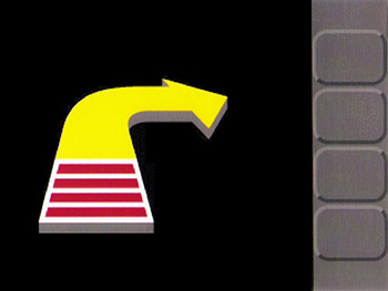
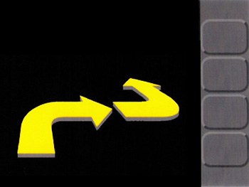
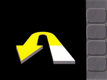
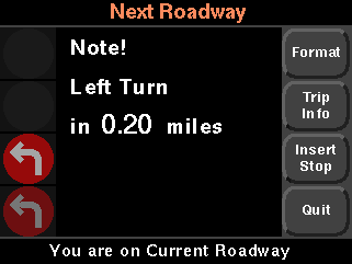
The client envisoned the route guidance mode of the system with large 3D arrows to indicate upcoming maneuvers. They also had a rough prototype with four red bars on top of the arrow that would disappear one at a time as the car approached the maneuver point. They had the right instinct as is demonstrated by the rich perspective displays seen in similar systems today. However, the rich geographical information required for such displays wasn't available at the time, nor was the high definition display technology that is standard in today's devices. I showed that a perspective view of maneuvers implied a degree of fidelity with physical reality that the system was incapable of displaying, and could be misleading and potentially dangerous to drivers.
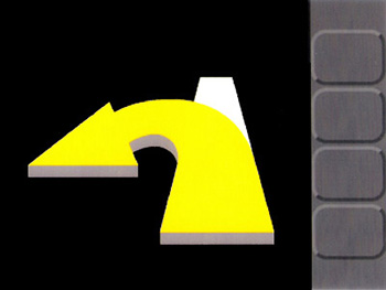
I made 3D studies in Adobe Illustrator of a variety of maneuver types that helped show the perspective rendering was misleading because it implied a degree of fidelity with physical reality that the system was incapable of displaying.
For example, it couldn't represent geographical landmarks, lane information, or specific maneuvers; instead, it could only represent general types of maneuvers. The limited resolution of the display was also an issue. The images shown here are scans of high resolution prints of PDF files.
-
- Navi RG animations

Route Guidance
I created animations with both verbal and tonal audio cues, each about 90 seconds in length, of a variety of types of maneuvers, in 3 formats, to act as a visual spec for the route guidance mode of the system. The original animations were created in an early version of Director on a Mac IIci. I've recreated abbreviated versions of each here. The audio tracks for the videos were lost.
- Logo design


Ovation!
I designed this logo for Ovation!, a presentation software package for UNIX, for Aaron Marcus and Associates.
The design attempts to evoke the ambience of an audience's ovation as the stage lights turn and flare. The circular shape of the letter 'o' and the bold, angular strokes of the other characters combine in a way that brings to mind the glare and cacophany of a live performance.
- Motorola Envoy

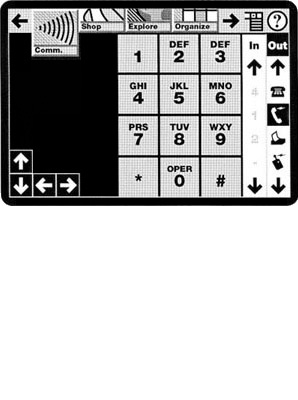
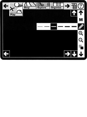
Motorola Envoy Personal Intelligent Communicator
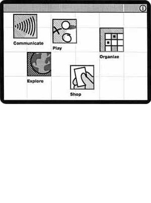
1992: I was the lead designer for AM+A on a project for Motorola's Envoy Personal Intelligent Communicator, a wireless communications enabled, touch-screen, handheld assistant that was essentially a precursor of the smart phones and tablets that are ubiquitous today.
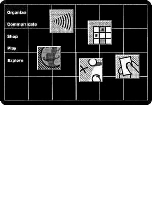
These designs were very high level. There were virtually no technical specs or features defined other than a touch screen, its approximate size, and wireless communications ability.
When the product was released in the summer of 1994, it was based on the Magic Cap OS. None of the early PDAs gained much popularity, but it's arguable that they laid the groundwork for today's smartphones and tablets.
-
- GUI comparison


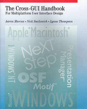
The Cross-GUI Handbook For Multiplatform User Interface Design
1993: While working at AM+A, on a project for Unisys, I analyzed, outlined, researched, and wrote a cross comparison of most of the prevailing GUI platforms of the day. Unisys hired AM+A to do a cross-GUI research project and it turned into a publishing opportunity. The project deliverables I created became the text of the book with input and editing by the authors and the publisher, Addison-Wesley.
- Oracle icons
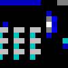

Oracle in Motion icons
1994: I designed these icons for a mobile communications management application for Oracle Corporation. Icons were very difficult to design at that time due to severe technological restrictions in resolution and color-depth. These had to be 22 by 22 pixels in a 16-color system palette.
-
- UI design
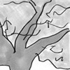

Genealogy Application for Microsoft Bob, exploratory sketches
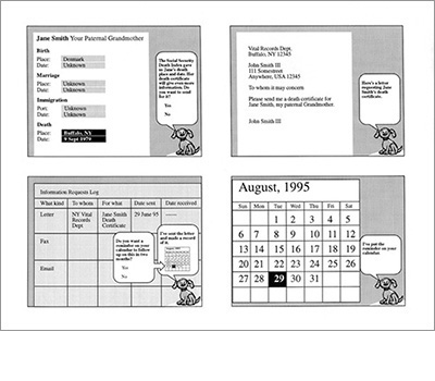
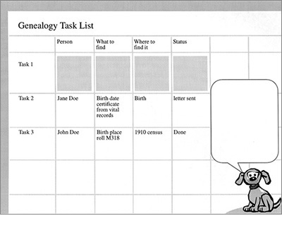
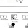
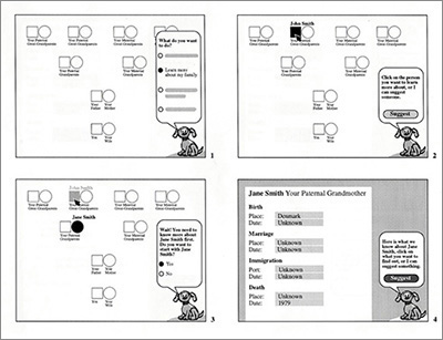
1995: As the Lead Designer for the Lifeworks Group* in Microsoft's Consumer Products Division my task was to envision a genealogy application for Microsoft Bob. These are some of the exploratory sketches.
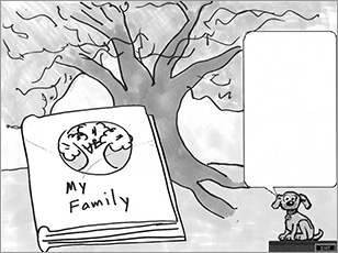
At a certain stage in the evolution of UIs, literal metaphors were very much in vogue and supposedly well supported by scientific research.
Microsoft Bob was just one of many such products that proved to be market failures. This article by Jakob Nielsen, from 1996, offers an interesting analysis.
Although I wasn't a fan of Bob, working on a genealogy application beyond the basic Bob platform offered an interesting challenge.
-
- Design specs

Interactive family tree diagram
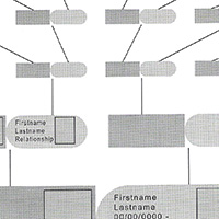
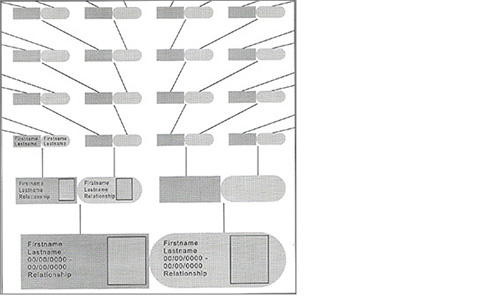
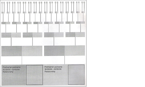
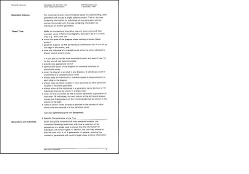
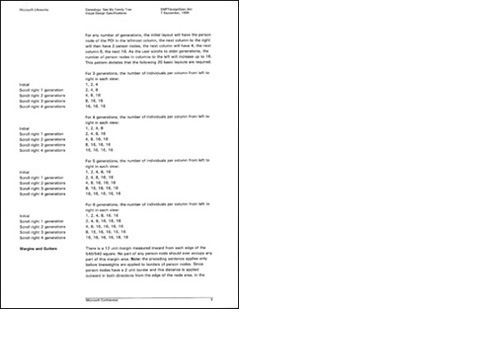
When Microsoft dropped Bob, our group* decided to develop the genealogy app as a stand-alone. I did extensive investigations into optimizing family tree diagrams in terms of density and relevance of information and the types of manipulations afforded, and wrote a design spec of the interactive family tree diagram for our developer team. These are some of the studies from that work.
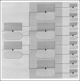
Seemingly simple, there are many types of family relationships and they can be graphically complicated to represent.
Existing genealogy products all had poor family tree diagrams, often requiring the user to scroll across several pages of information to view important relationships, and were mostly intended only for printing.
I set out to design a family tree diagram optimized for interactivity and spatial density of information.
-
- Interactive book

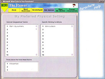
CD-ROM version of What Color is Your Parachute?
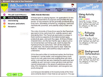
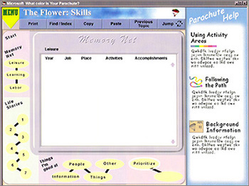
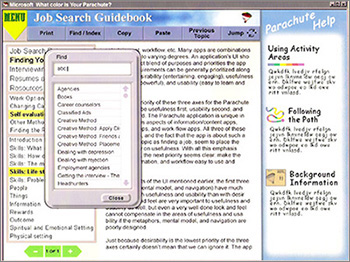
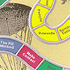
As Design Lead for Microsoft's Lifeworks Group,* I worked on an interactive multimedia CD-ROM version of What Color is Your Parachute?, the bestselling job search book by Richard Nelson Bolles. The book uses a variety of tools and actvities to lead the reader through a process of self evaluation. The application adopts a board game metaphor to present the process and provide familiar interaction models for the book's exercises.
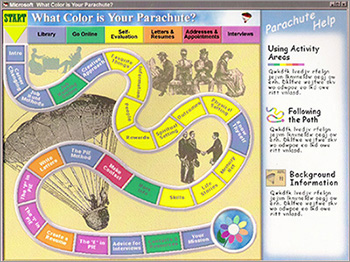
More than just a straightforward ebook, which didn't really exist at the time, this was to be a CD-ROM application based on the book.
A gameboard metaphor was appropriate for the lighthearted but process driven style of the book, and useful as a pacing mechanism to help the user work their way through the book's exercises and stages of self evaluation.
-
- Microsoft Office

Microsoft Office product design
1996: After Microsoft eliminated its Consumer Products Division, I was offered the position of Product Designer in the Microsoft Office Design and Usability Group. At that time Office was already a mature product used by millions of people every day, and, along with Windows, was a major source of revenue for Microsoft, accounting for roughly half of the company's 8.7 billion dollars of revenue in 1996.
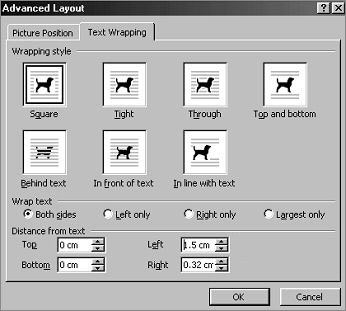
I worked on a variety of Office applications while with the group. The work consisted mainly of designing and developing interactive prototypes of new product features.
New features were driven primarily by program management. The prototypes were tested by usability engineers. The iterative process of design, prototyping, and testing typically continued until management either approved or cut the feature.
This is a dialog box from Microsoft Word that I redesigned. Original version is at upper right.
-
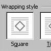
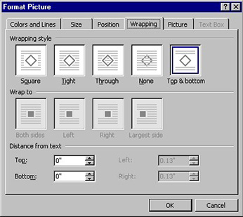 Original version
-
- Visual identity


The People's Coalition of the Carolinas, logo
I received a message in December of 2011, from friends who had moved away 10 years earlier to North Carolina. They had become involved in the Occupy movement and were founding members of a new political activist organization, The People's Coalition of the Carolinas. They asked me if I could design a visual identity for their group. This is the result.
-

 Facebook version
-
- Website design
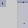

21 Projects: Project 21
I realize most of the work shown here is so old that it's not very relevant to today's job market. So, in lieu of more recent work which I don't yet have, I decided the design of my own website would be my best opportunity to show my chops. Also, my website would need to tell my story, as well as just show the work: actually reading about the projects would be important. So, to keep viewers from feeling overwhelmed by having to click through too many pages, my main goals were to get all the projects onto a single page, and to make it easy and compelling to flip through them.
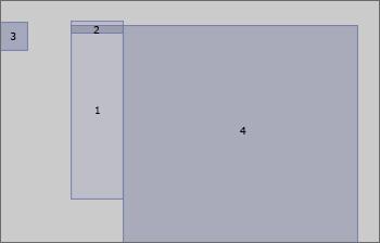 (1) The heart of the design is an unordered list.
(2) Each list item in the list contains a project.
Each project contains a hotspot div (3), which contains a thumbnail img and a sprite img, and a project-card div (4), which contains the project contents to be displayed.
Placing the pointer over the list, or clicking on the list, causes the project's sprite to pop up and its contents to appear. (If using a keyboard, the tab key also works to select projects.)Instead of a separate URL for each project, I used the css ':focus' pseudo-element to pin each project's contents in place when its list item is clicked. In some browsers, namely Safari and Chrome, an early version of the code worked perfectly using only html and css. But in IE and Firefox you couldn't pin a project by clicking on its thumbnail. A later version fixed that, but it also broke the highlighting between the list and the thumbnails. Finally, with some jQuery added, it works seamlessly in all four browsers.-
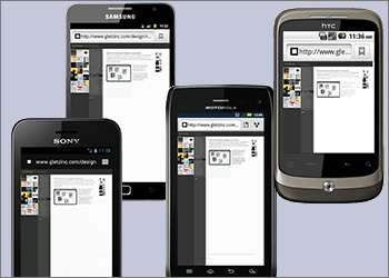
I used browserstack.com, a site that simulates various oerating systems, browsers, devices, and screen resolutions, to test the site on mobile, touch-screen devices.
This proved to be a crucial tool because, initially, I had not reset the viewport meta tag width from its default setting, and you had to scroll to reveal the small mouseover images for each project. Once I corrected that oversight it worked great.
-
